quoin typeface
fall 2019 • typeface design
For my Type 3 class, we were asked to design a typeface from scratch. When I first learned about the different categories of typefaces, I fell in love with slab serif typefaces. I knew for this class that I wanted to create my own slab serif. My typeface was inspired by 19th-century letterpress posters that used large wooden type. During this class, I was able to create a complete typeface and typeset it using Glyphs. This project gave me a deep appreciation for the labor and precision that is required to make a typeface. I also left the class with improved knowledge for critiquing typographic nuances, and fine-tuning typographic elements.
about the typeface
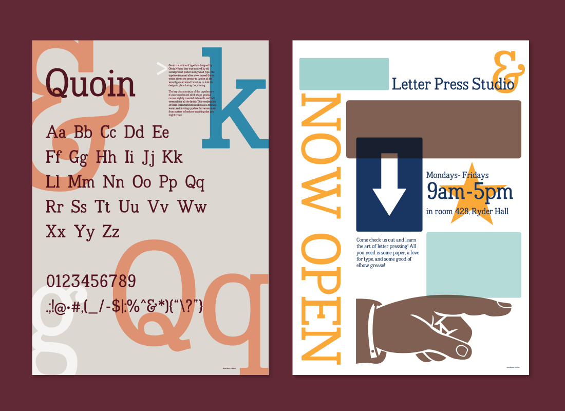
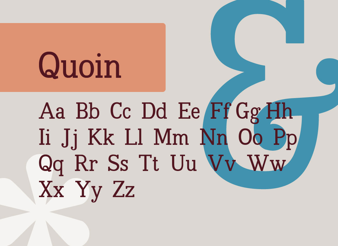
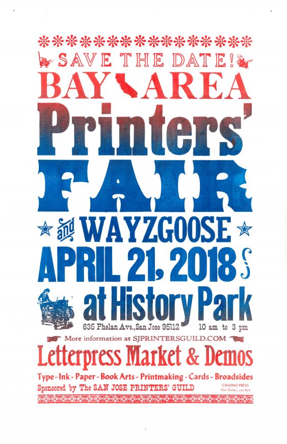
Quoin is a slab serif typeface inspired by wood type used in old letterpress posters. The typeface is named after the tool quoin which allows the typesetter to tighten all the type and wooden furniture to hold the design in place during the printing process.
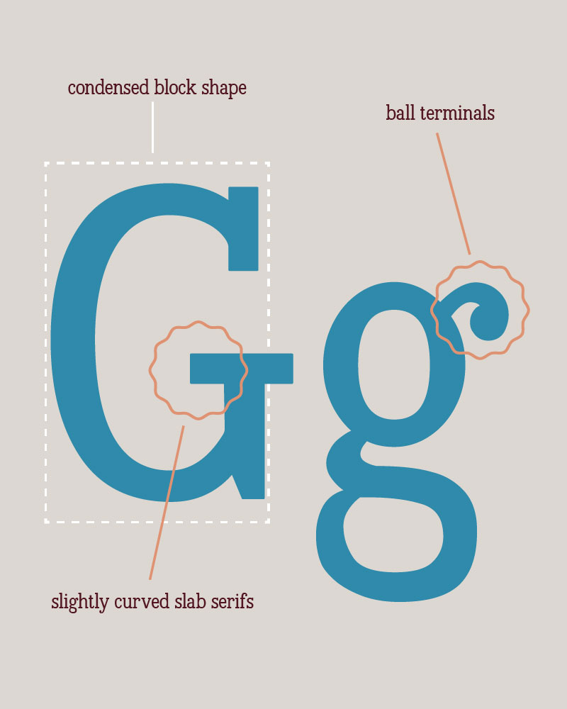
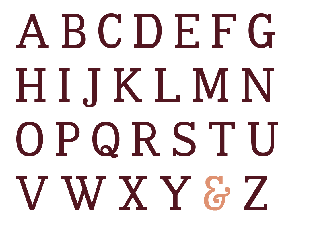
The key characteristics are its condensed block shape, gradual curves, slightly curved slab serifs, and ball terminals for all finials. These characteristics create a friendly, warm, and inviting typeface for use in posters, books, and more!
design research & inital designs
I began the design process for this typeface by looking at as many typefaces as I possibly could as well as historical documents and designs to see all different typefaces both past and present. This research allowed me to see what designers have done to draw inspiration from and to prevent plagiarism.
uppercase letters
After researching typefaces, I began to design all the uppercase letters. During this part of the process, I focused on identifying the major elements I wanted in the typeface. I considered three primary elements: the overall shape of the letters, the appearance of the serifs, and the relationship of the curves to the diagonal lines.
lowercase letters
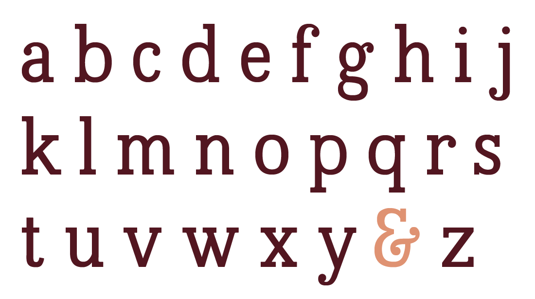
When I began to design the lower case letters, the elements that I had created in the uppercases were solidified and fine-tuned. I loved designing the lowercase letters because I got to make the fun decisions of what the lowercase “a” should look like or whether the typeface has a double story “g.”
During this part of the process, I continued to fine-tune the uppercase letters and made sure they harmonized with the lowercase letters.
broadside & typographic posters
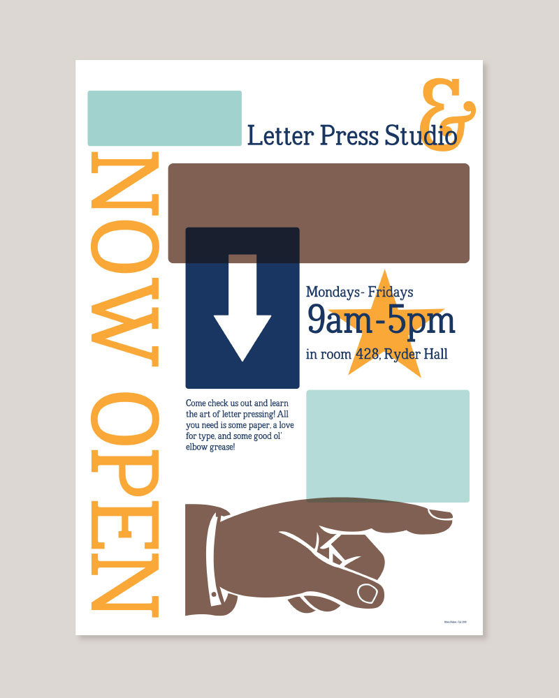
After completing the uppercase, lowercase, and punctuation we were asked to design two A2 posters. The first poster showcases the broadside of the typeface and the second poster shows the typeface in use. These two posters were the culmination of 14 weeks of hard work and provide a fantastic representation of the qualities and features of the Quoin Typeface.
