JFK Terminal 4 Kiosks
Fall 2018 • UX/UI design • UX Designer
While working at Ronik Design, I redesigned the UX/UI for JFK Terminal 4's Kiosks. Before we began this project the kiosks were being used to help travelers find their way around the terminal; however, the T4 staff noticed that many people were going to the help desk asking for directions to different terminals or how to get into the city. To solve the problem, they hired Ronik to redesign the kiosk to be a more informational tool for travelers moving in and out of the terminal. Under the creative direction of Roberto Gonzales and Nicole Barth, we transformed the kiosks into a platform that helped travelers navigate the terminal, discover shops, and restaurants, as well as help T4, promote special events and unique services.
design research
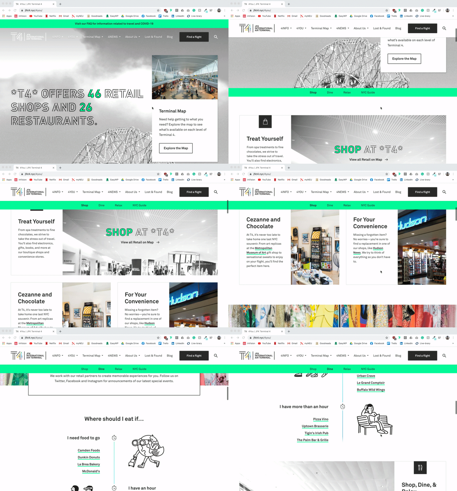
In 2016, JFK Terminal 4 was rebranded by Base Design and Ronik was hired to apply the new brand to their website. The website design was a huge inspiration for the designs used in the kiosk UI. We wanted to make sure that all of the elements and modules were cohesive with all user interfaces that T4 travelers might use.
Another big part of the design process was ensuring the designs took into consideration all different users from elderly people, the disabled, to rushed travelers. With these factors in mind, we created a platform that is easy and pleasant to use.
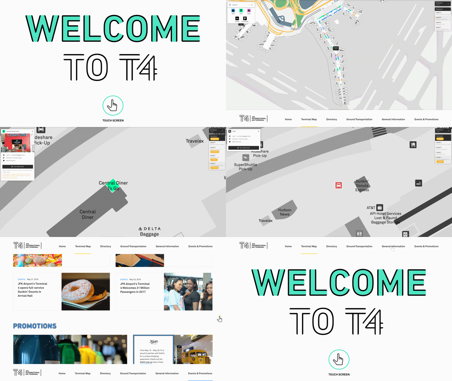
attraction loop & homepage
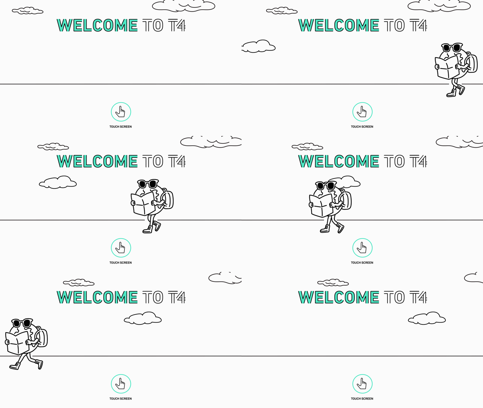
The attraction page was the first page I designed for the kiosks. We wanted to have a design with an animation or a full bleed image advertising a special promotion that was occurring in the terminal. The objective of this screen was to attract travelers' attention in the busy terminal.
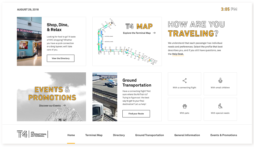
The homepage was the second page that I designed. The homepage was essential to helping travelers find the answers to the most commonly asked questions as well as giving the terminal a way to promote unique events or services going on at T4.

terminal directory
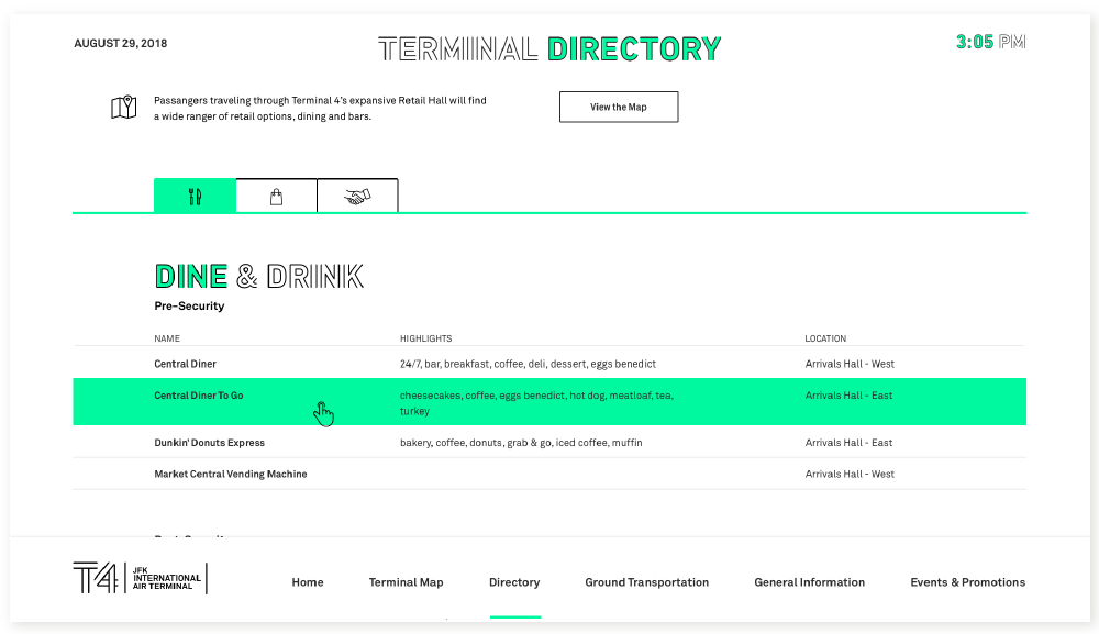
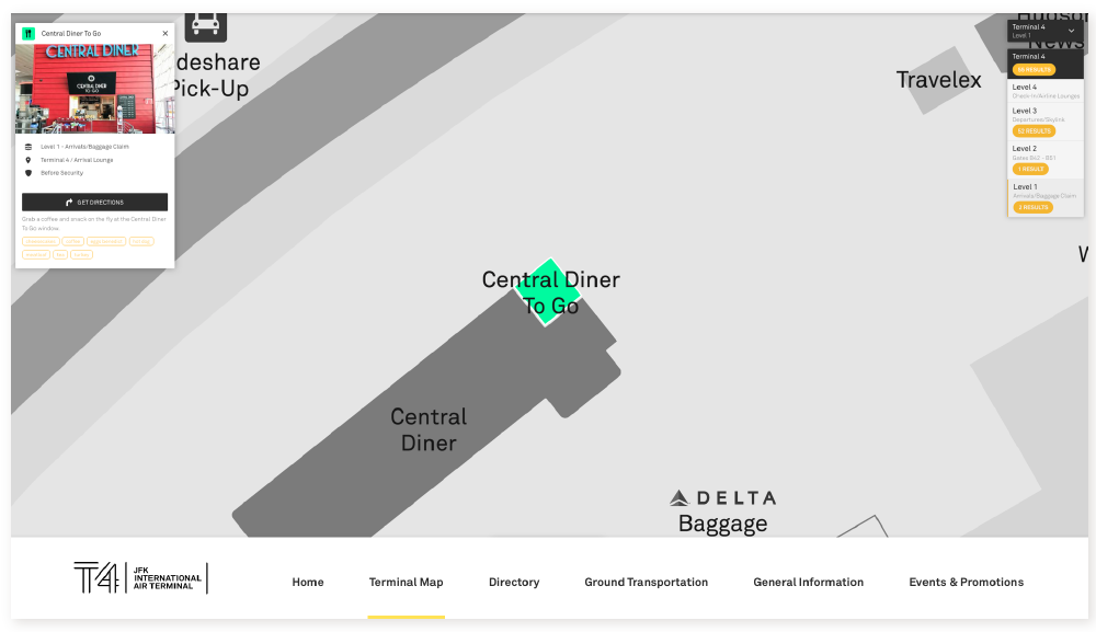
A central aspect of the redesigned kiosk's UX/UI was to create a page that would help users find restaurants, bathrooms, and shops throughout the terminal. I pulled inspiration from the terminal directory page on the T4 website and we designed the kiosk page for easy navigation and searchability. Each restaurant, bathroom, and shop was linked to the terminal map. With one tap the users were given directions on how to navigate to their destination.
ground transportation
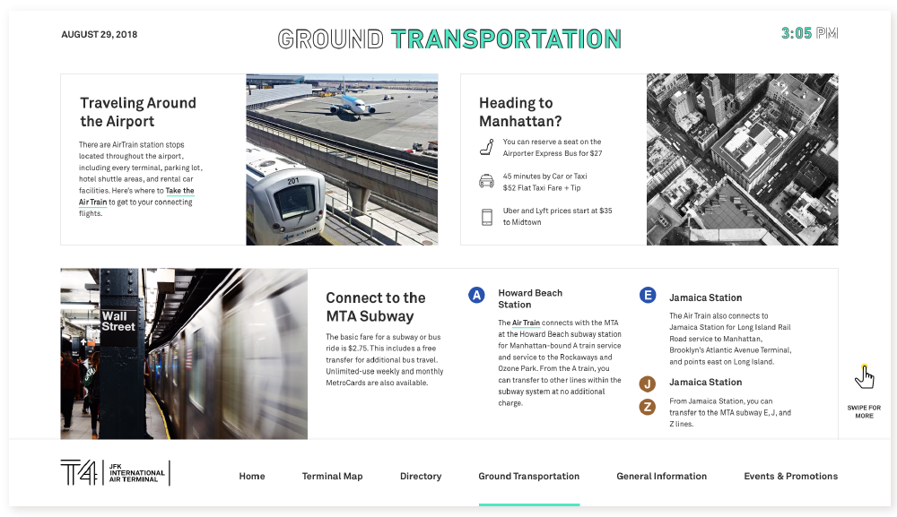
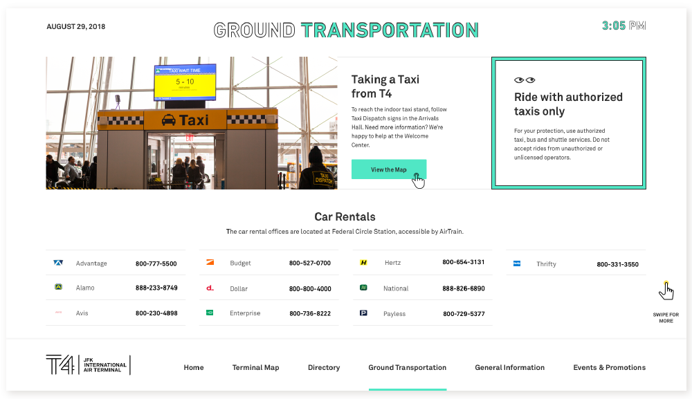
The client also wanted a page dedicated to common questions their help desk would get about ground transportation since it was a source of confusion for many travelers. This page had resources that informed travelers how to travel within the airport as well as how to get to Manhattan via taxi, coach buses, ride-share, or public transportation.
general information page
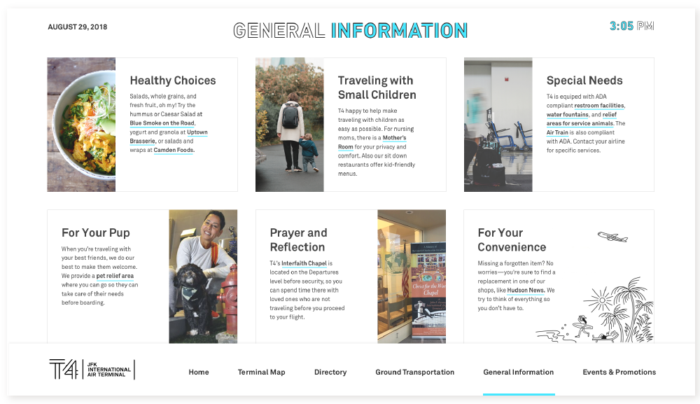
The General Information page was designed to showcase the unique amenities and services at Terminal 4. I designed the page to highlight six common topics for travelers using the card style that is used throughout the T4 website.
promotional page
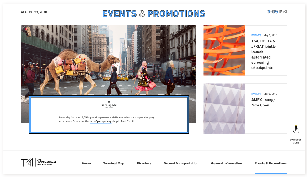
The final page for the kiosks was the promotional page. The client wanted a page to advertise special events and promotions going on in the terminal such as pop up stores or individual store promotions. Since promotional events fluctuate in number, I was tasked with designing the page to be responsive to the events. This ensured that the design always looked consistent whether there was a high or low volume of promotions at any particular time.
